

Soulbound (Legacy of Tril #1) - A minor example; I wrote a review of this book (it'll go live as this week's First Read Friday) and pointed out that nowhere in this novel is there leather armour. It also made me expect more fighting and less angsty teen girl.

This edition of Outlander which makes the book seem like a few things it isn't: a typical romance novel, and set in England. It's set in Britain and it's one of the most well researched pieces of fiction out there; oh and the hero is supposed to be a Scottish warrior, he does not look like one there. This cover is one of the reasons Diana Gabaldon requested that people not be used on her covers.

If this didn't actually say James Bond I would have absolutely NO IDEA that Colonel Sun was a James Bond story...in fact I wouldn't have any idea what it was...this cover is just messed up...


Can I just say, as a Harry Potter fan I am REALLY glad these Italian copies of Philosopher's Stone and Chamber of Secrets were not my introduction to the series? There is nothing relevant, save for the chess pieces going on in either of these cover drawings. Also, what is up with this artist and dead animal hats?

Given the blue colour, the depiction of a free bird in flight, and the fact that it's the closer of the trilogy, you would think from this cover that it means Katniss and company are getting a happy ending right? OH BUT YOU COULD NOT BE MORE WRONG! The contents of Mockingjay are as dark and twisty as early Grey's Anatomy Meredith's soul and more akin to a George R.R. Martin book where any character is free game and happiness is a distant memory.
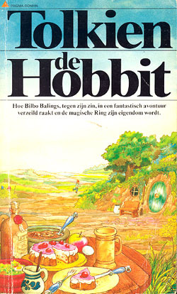
This Dutch cover of The Hobbit makes me think more of Winnie the Pooh's adventures in the 100 Acre Wood instead of the journey to defeat Smaug that actually takes place.

A comment about most of the Kelley Armstrong covers (the ones with people depicted) is that they have scantily clad or naked women and men in provocative poses which is fine for romance novels but none of Armstrong's novels is a romance. Sure there is romance, but it's always a background element, a hazard of having relationships between one's characters if you will and Stolen is no exception, especially because the two main characters spend most of the book apart...

And last, but certainly not least, the aforementioned Cinda Williams Chima book. There are no dragons in this book, there are no ships, indeed no seas mentioned at all, and there are definitely no staffs like this. The worst transgression of this Dutch edition though? The title isn't even the same, the book is The Demon King but for some reason, unknown to anyone, the Dutch title became Black Magic...even the author doesn't get it. The comments point out, and I am inclined to agree, this would make a much more fitting cover illustration for her book The Wizard Heir but you'd still have to lose the ship.
What book covers have you come across that have made you stop and go, "Say what now?"?
-- Ren
No comments:
Post a Comment